The most asked question for an eCommerce store is “What is a good checkout page?” Is the existing, default, conventional multi-page checkout good enough? Firstly, I will discuss some pros and cons of Multi-page Checkout. Secondly, I’ll explain to you how One Page Checkout can help you overcome all your checkout page problems. Let’s begin.
Multi-Page Checkout looks simple and customers feel comfortable while using it because it directs them to the next step on a different page once the step is completed. But the major constrains of Multi-Page Checkout are time and lengthy process. The long-form looks boring and people quit in the middle of the process.
Why Clients run away from eCommerce Checkouts
Not interested buyers: Some of the shoppers do window shopping and they visit your store only to compare price. You cannot do anything to stop them but offering deals and offers can attract such window shoppers.
Long Loading Time: If your Checkout Page is not optimised and takes longer time in loading then you should start working on it on priority. One Page Checkout Module is mobile responsive and loads quickly.
Mandatory Registration: Another reason which drives your customers away from the website is mandatory registration or a registration popup and this annoys them.
Limited Payment and Shipping options: If you have limited payment methods and shipping options then you might face cart abandonment due to this. One Page Checkout addon allows the owner to add multiple Payment Gateways and Shipping methods.
Basics which Improves Checkout Flow
Single Page Checkout
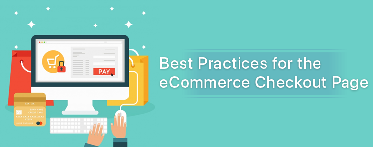
Single page checkout is the one which displays all the required fields like registration form, payment options, shipping details, cart information on a single page. One page checkout enhances customer engagement.
After this, my main focus will be on the features which are incorporated in One Page Checkout Module. These features make it unique and help in improving the checkout experience.
Call to Action
Checkout will be smooth with a call to action buttons. On the product page, add the buttons like‘add to cart’and ‘Checkout’. You can add attractive, colourful buttons and update them from the backend of One Page Checkout Module.
Allow them to update the cart quantity
With One Page Checkout Module, customers can update the cart from their checkout page. They can alter the quantity or remove the product directly.
Make it mobile responsive
If you want to improve the checkout flow then make your website fully responsive for all possible gadgets. One Page Checkout Module is compatible with mobile, tablet and desktop.
Nail the Checkout User Experience
Sleek and Simple
The Front-End of the One Page Checkout is sleek and simple. The UI of One Page Checkout is engaging and all the fields are clearly visible. Avoid the clumsy look of checkout page by adding One Page Checkout module in your eCommerce store.
Well organised and clean
All the necessary steps are well organised on one page and to keep it clean, admin can pick and drop the fields wherever he/she wants. Various layout choices make it easier.
Layout Choices
Store owner gets three layout choices with One Page Checkout addon. Admin can use a layout with a single column, two-columns or three- columns. Single column formats reap two advantages. A single-column layout would be simpler while using mobile for the checkout. Single column formats perform even easier on smaller displays, so in the long run, this is less of a task for you.
Avoid Unnecessary Fields
With One Page Checkout module, admin can make some of the fields mandatory and others as optional. This way the user can skip the optional fields and save some time.
Do not clutter
Suggestions for related products can be great for upselling, but those products need to be relevant to be successful. Showing irrelevant products on the checkout page can divert the customer and you may lose a good lead.
Social Login
You can give a better checkout experience by providing social login through Facebook, Google+ or PayPal. One Page Checkout module is incorporated with social login functionality. This makes the registration process fast and effortless.
Avoid Checkout Surprises
If you want to give offers or rewards to your customers them Checkout Page isn’t the right place. On Checkout Page you should add a field for applying Promo Codesbut do not give a new one.
If you are going to charge extra for shipping, size or color then inform your customer beforehand and do not wait till the customer makes it to the checkout page. Taxes and extra shipping charges on the checkout page will not surprise your customer but it will shock them!
Available payment options: Show all of your payment options at checkout page, not only payment but shipping options too. A customer can choose any of the payment gateways for purchase.
Security badges displayed clearly: Show customers that your site and the payment modes are secure. Security is the major concern for most of the buyers.
Do not push customers away by doing these mistakes.
Closing Thoughts
These are some of the best practices for checkout. I hope this article clarifies your e-commerce checkout flow do’s and don’ts. The intention is to make the entire process as easy as possible to increase UX customers and, in turn, contribute to higher sales and conversion for you.
You can visit the Knowband store for the product demo and understand the functionality of the Prestashop, OpenCart, and Magento 2 modules.